Beverley Racecourse
Branding Refresh
The Challenge
Every year new concepts are developed to promote Beverley Racecourse’s calendar of
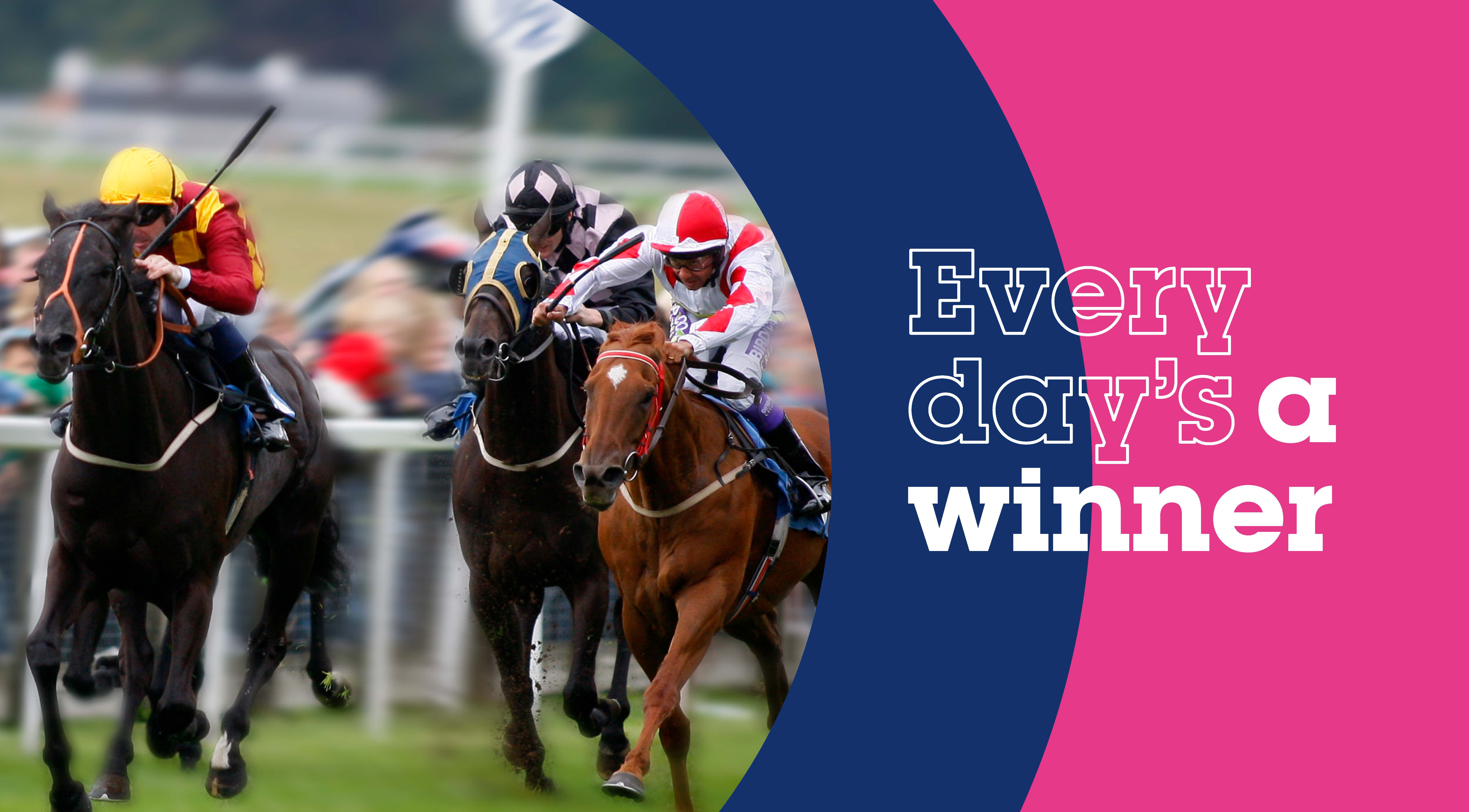
events and racedays. This includes omni-channel outputs such as emails, programmes and social media graphics. The challenge was to make this eye-catching, appealing and notably different from previous iterations without straying too far from the racecoures’ branding.
Research & Discovery
There are key days in the racing calendar which required themed assets to be worked up e.g. Ladies Day. There are also ‘standard’ non-themed racedays which can utilise the same design throughout the year. The Racecourse had a preexisting logo, typeface and colours which they wanted to retain.
Ideation & Solution
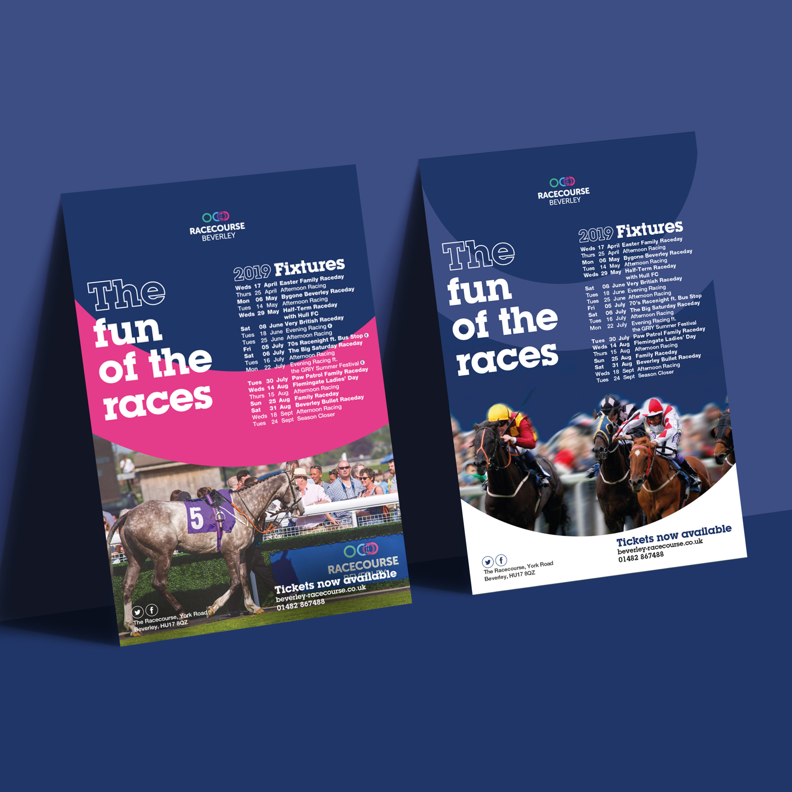
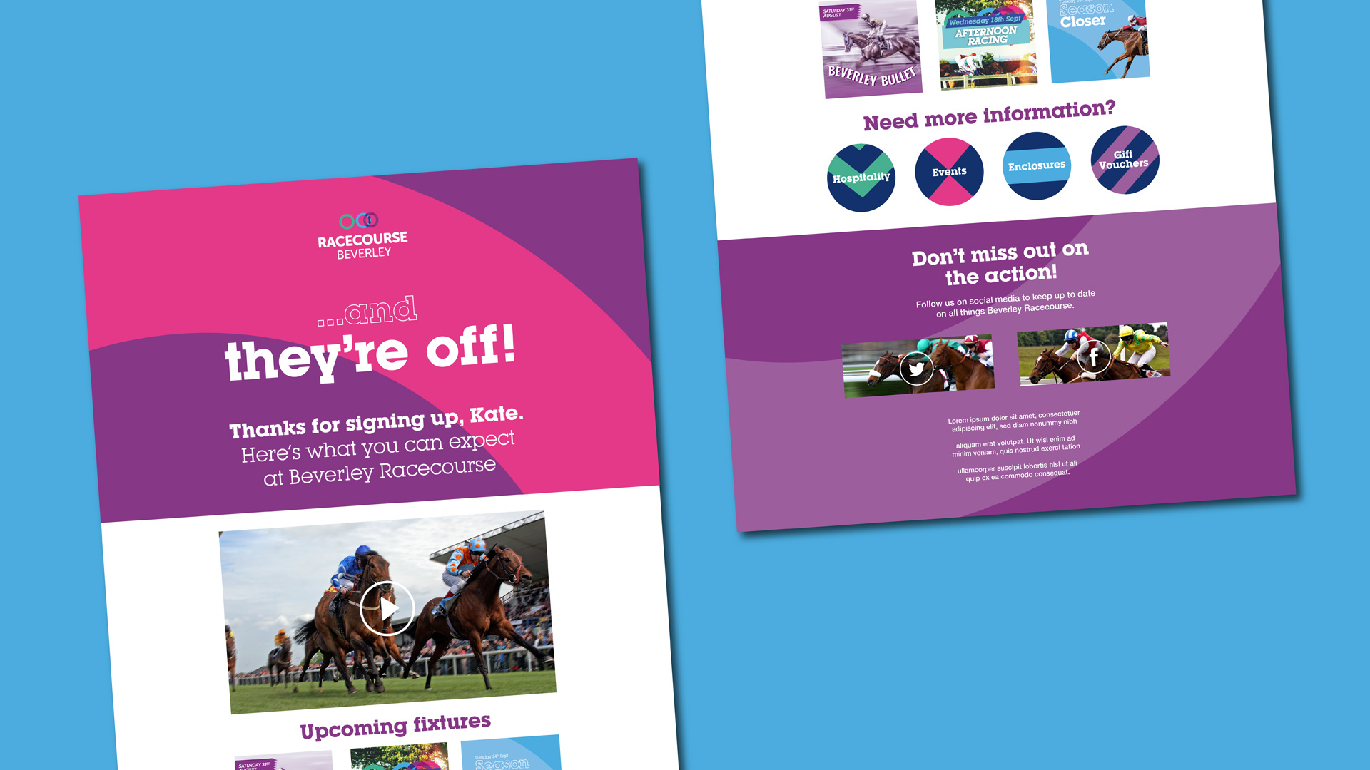
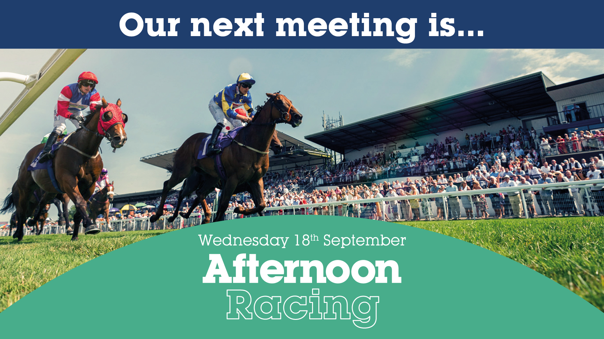
I presented an initial idea which utilised the rings and colours of the Racecourse’s logo, massively scaled up. This was well received by the client and therefore provided the basis of the ‘standard’ racedays.
I drew inspiration from brightly coloured, patterned jockey silks to create icons used in the email templates.
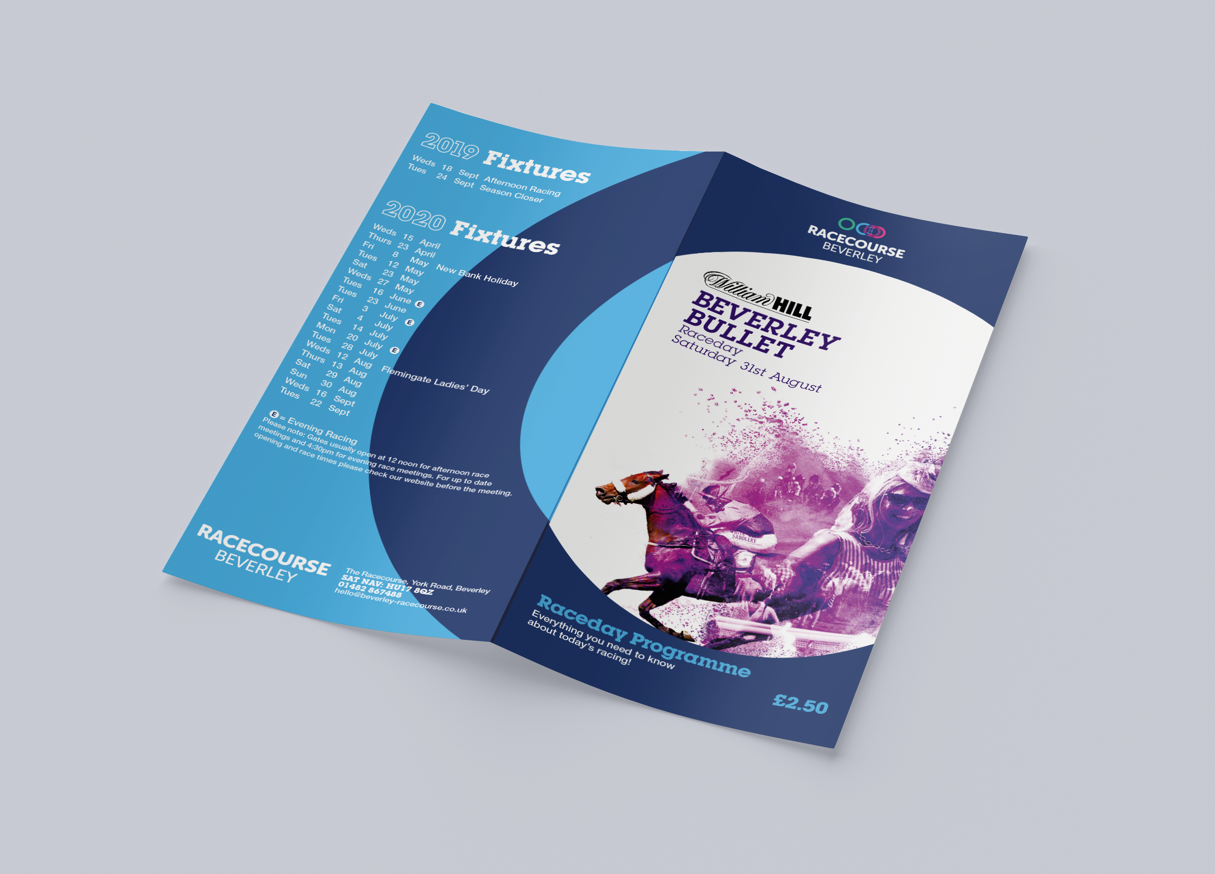
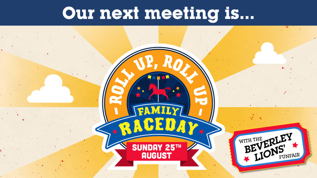
I focused on creating unique creative for each themed event to help give stand-out and differentiation against the standard racedays.
The Solution
A cohesive and contemporary set of assets were created, successfully promoting the ongoing race season.